Driving AI Adoption and Usability at Scale through UX Research
Project BAM
IBM, 2024
TL;DR
I led UX research to scale a rapidly launched MVP to a widely used product with 35,000+ users and half a billion API calls. As the sole UX researcher on the team, I conducted an expedited qualitative study delivering actionable, evidence-based UX insights. This study revealed misaligned assumptions about user workflow, identified where user expectations didn’t align with product behavior, and uncovered a lack of awareness of existing features. My work on this product contributed to a 62% rise in active users and a 31% increase in API calls. These insights also fed IBM's open-source design system (Carbon for AI) and influenced watsonx.ai, earning industry recognition and showcasing how rigorous UX research accelerates value realization at scale.
Case Study
6 min read
Increasing adoption and improving usability
You join a team transforming a quickly launched MVP into a product that will eventually serve 35,000 users. As the only UX researcher on the small team, how do you apply your limited resources to identify and resolve key post-launch friction points that prevent existing users from experiencing the full value of this product and keep new users from understanding its offering?
I dove into this question head-first when I joined the team responsible for BAM (short for “Big AI Models). BAM is an internal AI development studio that enabled IBM employees to access, test, and build with AI models (LLMs) at the dawn of the public's AI awakening. My team launched BAM in November 2022 before I joined, the same month that ChatGPT became available to the public. Prior to launch, my team conducted a short sprint of research to validate the MVP. Outside of this research, they made necessary assumptions about how people would use BAM because:
- They needed to launch quickly to keep up with the changing gen AI market.
- There weren't established patterns or practices to pull from because most users had never interacted with gen AI technology before.
BAM's launch was a success; IBMers built with generative AI for the first time using BAM's graphic user interface (GUI) and/or its APIs via the command line interface (CLI). I joined the team in 2023 as the first and only dedicated UX researcher. Building on top of BAM's initial success, I focused my UX research on scale by defining opportunities to increase adoption and improve usability.
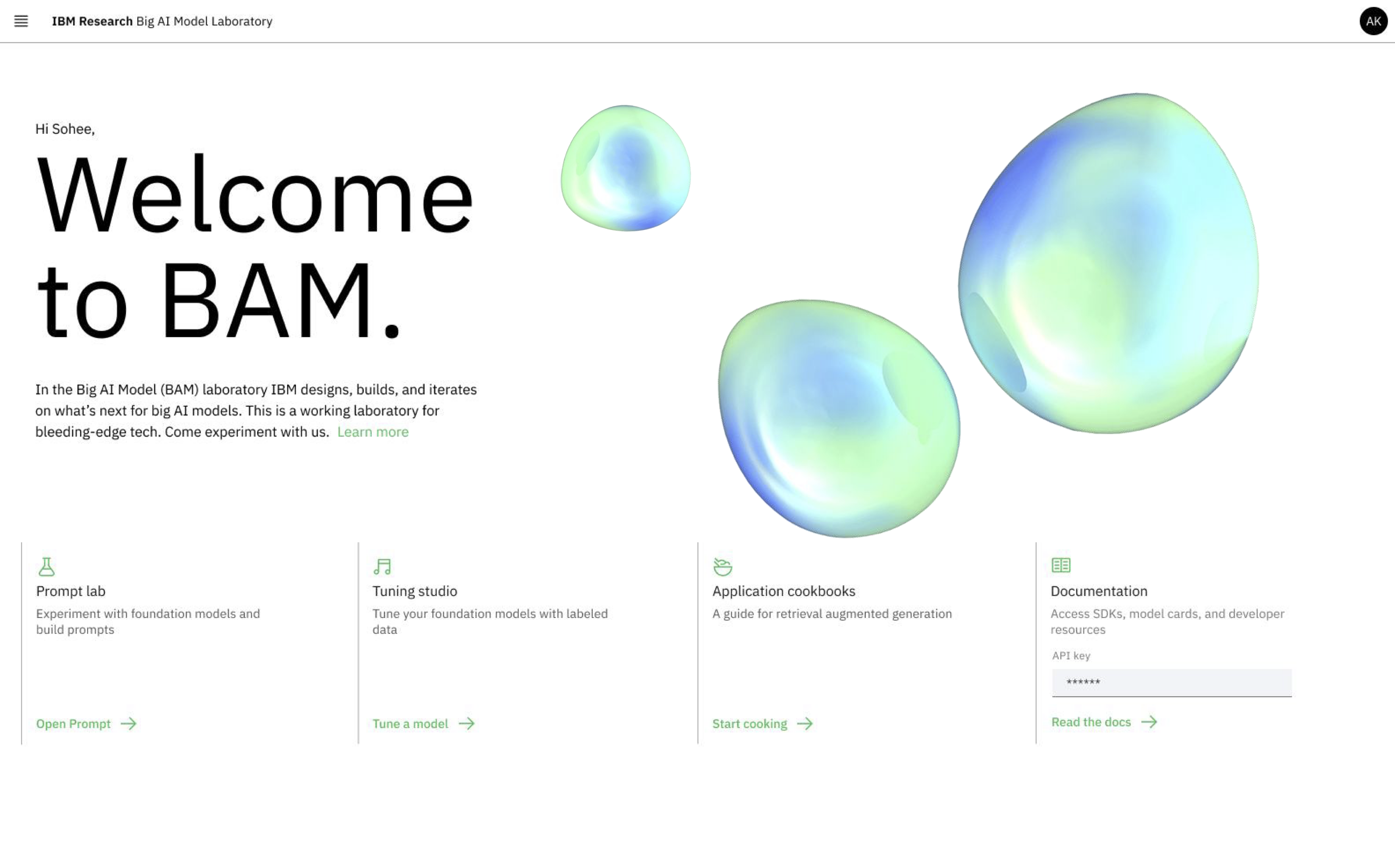
BAM's homepage
I sought to transform BAM from a quickly-launched concept into a mature product that aligned workflows with user's mindsets and goals. I designed and executed a study blending in-depth interviews and contextual inquiry to understand how people actually used BAM and highlight areas of friction. I identified ten BAM GUI users by analyzing BAM's usage data and ran 30-minute semi-structured interviews with each participant over seven days*. This study identified key assumptions made prior to launch about how future users would work with gen AI that prevented actual users from recognizing the full value of this groundbreaking product. The following insights are three core findings from that effort focusing on BAM's prompt lab feature in the GUI.
*I did this work at light speed, going from research question to insight delivery in about two weeks. Click here to learn more about my process.
Insight 1: Assumptions lead to perceived malfunction
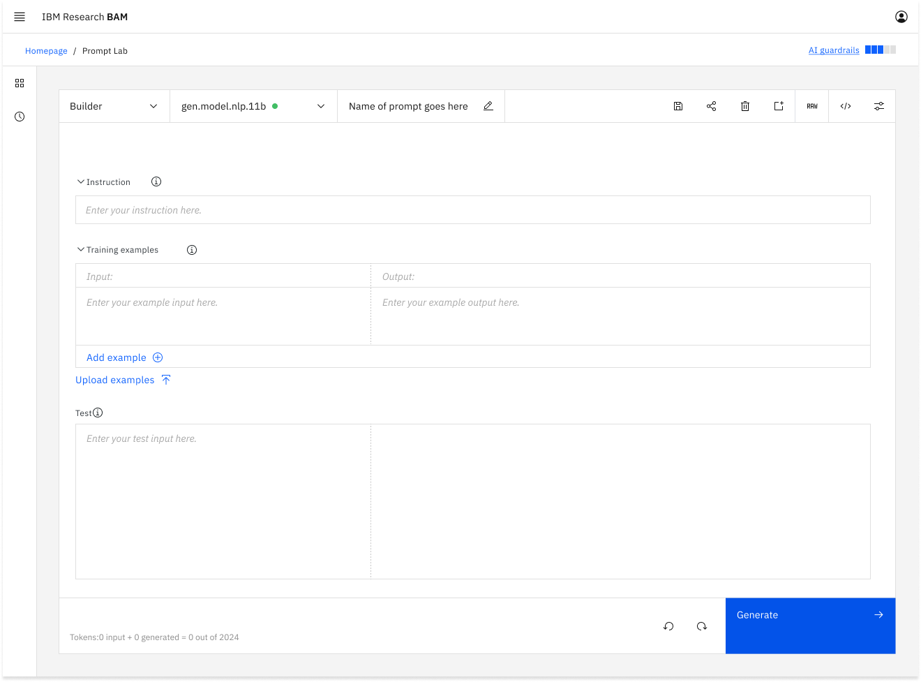
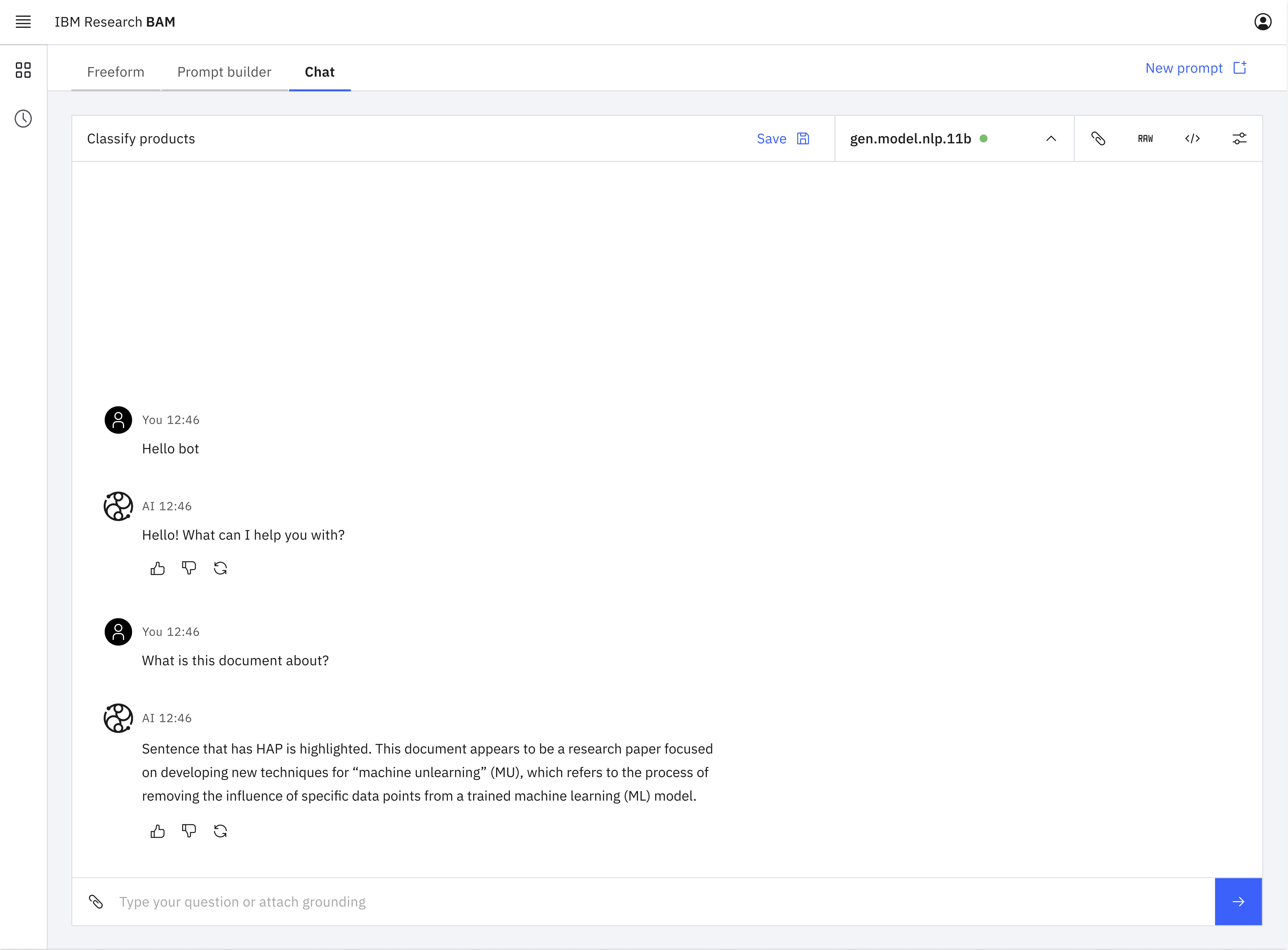
The prompt lab graphic user interface (GUI) was the core of BAM's functionality. It allowed AI builders to develop and test prompts with different LLMs. The prompt lab had three “modes” or interface styles for prompt engineering: freeform, structured, and chat. Prior to launch, the team built these modes assuming that a user would work on multiple prompts each utilizing a different mode during a typical single session.
The prompt lab modes prior to UXR shown as a drop down menu supporting an imagined multiple-modes-per-session workflow.
My study identified that no participants followed the assumed multi-prompt workflow. Participants iterated on a single prompt in a single mode for an entire session. They perceived modes just as one of the many levers they could tweak in the process of iterating on a single prompt. This led to expectations that the prompt and model would persist if they switched modes. In reality, the model would revert to a default model when the user switched modes and the prompt they were working on in one mode would not transfer over to the other mode. This unexpected interaction was built on the assumed multi-prompt workflow.
This mismatch caused users to think that BAM was broken. I reviewed user feedback from the BAM Slack channel and identified several individuals who had reported “bugs” when BAM had “lost” their prompt or switched models “on its own” when users changed modes. Their expectations didn't align with the assumption built into the interface. BAM wasn't broken; it was functioning perfectly for a workflow that was out of synch with users.
With this insight, my team redesigned the interface to elevate modes in the information architecture to clarify the cascading impact they had on the rest of the interface. We also changed the tool's behavior to better align with user expectations by maintaining the same model when switching modes. These changes brought the interface in line with users' mindset and expectations.
The prompt lab modes redesigned after UXR as separate tabs at a higher level of infomation architecture within the interface supporting a single-prompt-per-session workflow.
Insight 2: Intimidating features make users develop bad defaults
The design of modes in the prompt lab GUI also introduced friction for users selecting the most advantageous mode for the prompt they were engineering. Each mode served a different purpose:
- Structured mode broke the prompt structure down and provided guidance.
- Freeform mode provided an open input box for ultimate flexibility.
- Chat mode provided a chatbot-style interface ideal for multi-turn dialogue-style prompts.
When the product team initially designed BAM, they assumed that users would select the mode that was most appropriate for their prompt type and context. They assumed that most users would use structured mode for single-turn prompts because the interface helped users understand and follow best prompting practices.
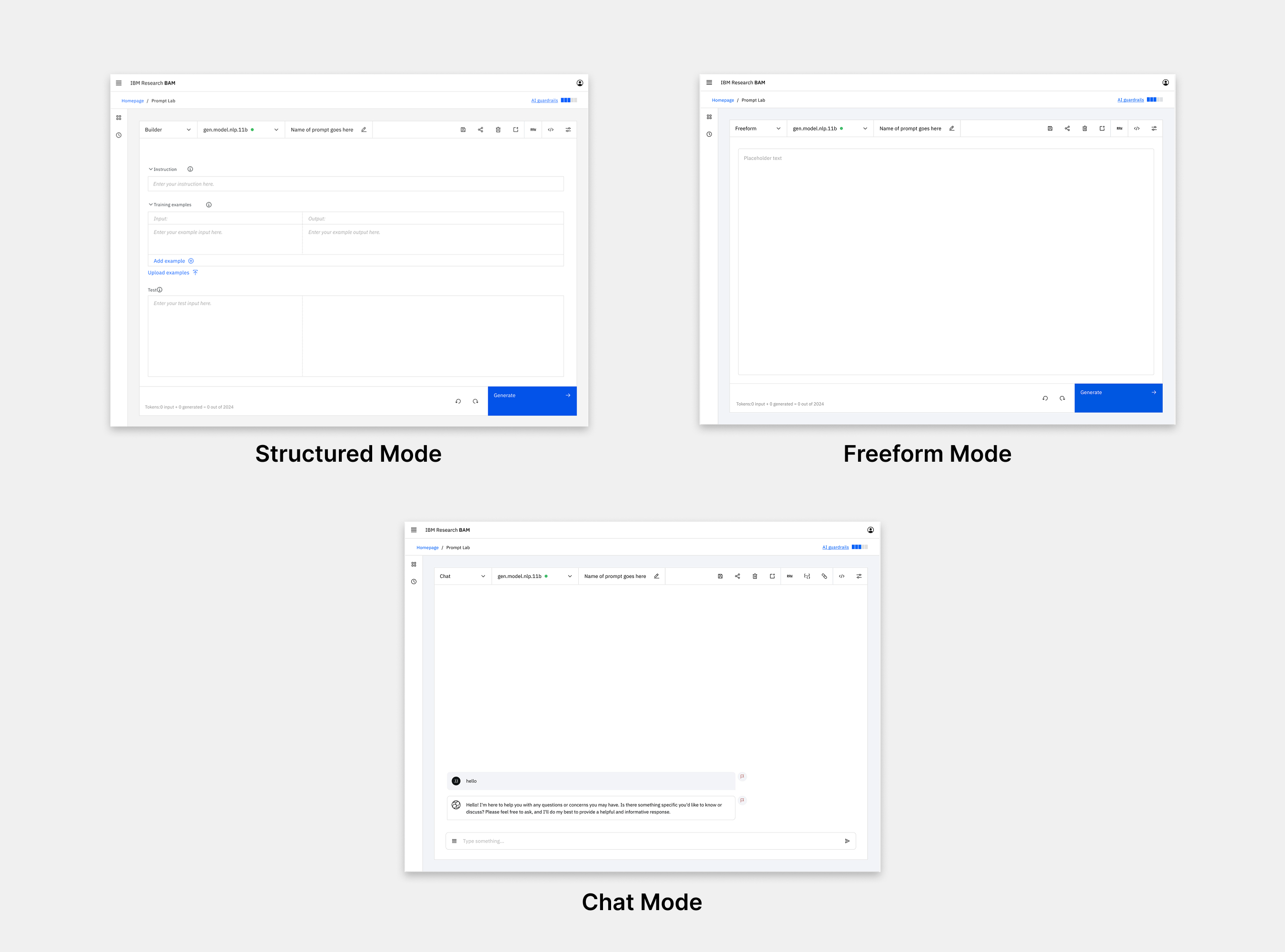
The three prompt lab modes prior to UXR highlighting the complexity of the interface.
My study uncovered that most participants had a default mode that they used most of the time. They didn't change the mode to fit the type of prompt they were engineering. Most participants defaulted to freeform because it appeared straightforward, was not intimidating, and implied that there was nothing "extra" (like a system prompt) under the hood.
The assumption that users would pick the mode best suited to their needs turned out to be untrue; users were intimidated by the complexity of the structured mode design and didn't understand its value. This led them to choose freeform as their default even when they would have benefited from structured guidance. This gap in their knowledge was illustrated when, after learning how the different modes functioned during testing, several seasoned users expressed an intention to start using structured mode instead of their default freeform.
Acting on this insight, my team designed a new experience to make the modes more accessible and understandable. To target new users, we created a first-time user experience that provided information about the benefits of each mode and the context it was best suited for. To educate existing users, we added explanatory hover states to each mode tab. We also used the in-field placeholder text in the prompt editor itself to illustrate how a single example prompt would translate across each of the modes. This taught users how prompt-engineering techniques needed to shift to fit each mode.
The redesigned first-time user experience provides information about each mode.
Insight 3: Bolster awareness before investing in new features
My team regularly released new features keeping up with the astonishing rate of change in the gen AI market and providing the latest and greatest functionality to users. We assumed that we needed to deliver new features in order to deliver value. However, my study showed that instead of going through the costly process of developing new features, there was an opportunity to deliver value by simply making users aware of the features that already existed.
When the team launched BAM, they were moving too quickly to implement an onboarding experience. Knowing this, they strived to make the UI self-explanatory so that users would understand the available functionality by interacting with the interface. BAM's initial success seemed like confirmation that this strategy worked.
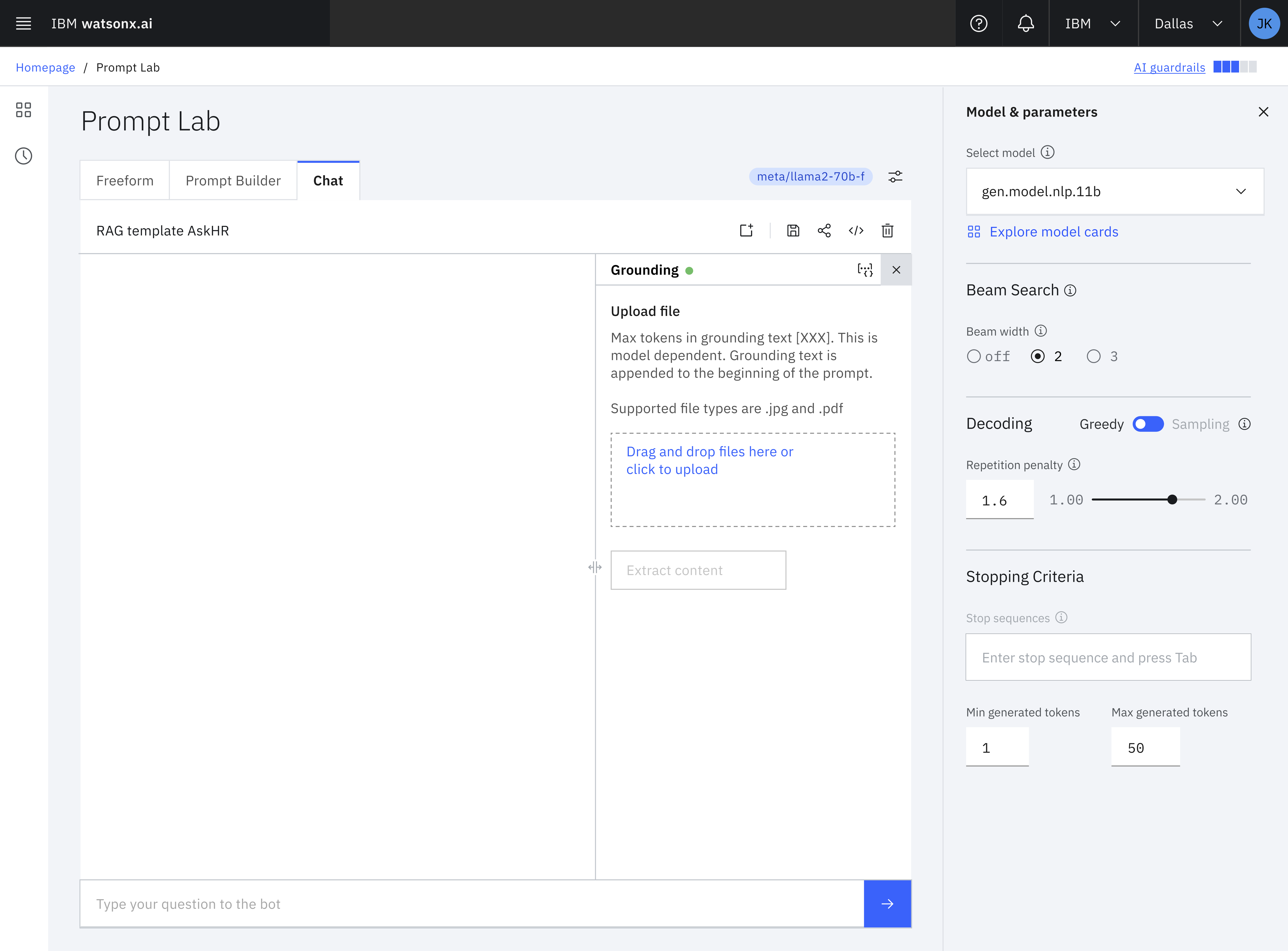
The BAM interface could be complex with many features of which users weren't always aware.
My study uncovered that many users were not aware of BAM's core features. Participants learned BAM by clicking around until they figured out how to make it work for their first use case. This consistently led to gaps in participants' knowledge about BAM's capabilities. Once participants had figured out how to use BAM for the task at hand, they ceased looking for additional functionality assuming that they'd found everything that was relevant to them.
These insights led to the realization that we could create additional value for existing users simply by increasing awareness of existing features. We redesigned the UI to increase awareness by:
- Adding text to the previously icon-only toolbar so that users could verbally understand a feature on first encounter rather than needing to click the icon to understand its functionality.
- Adding informational hover states with video explainers for core features.
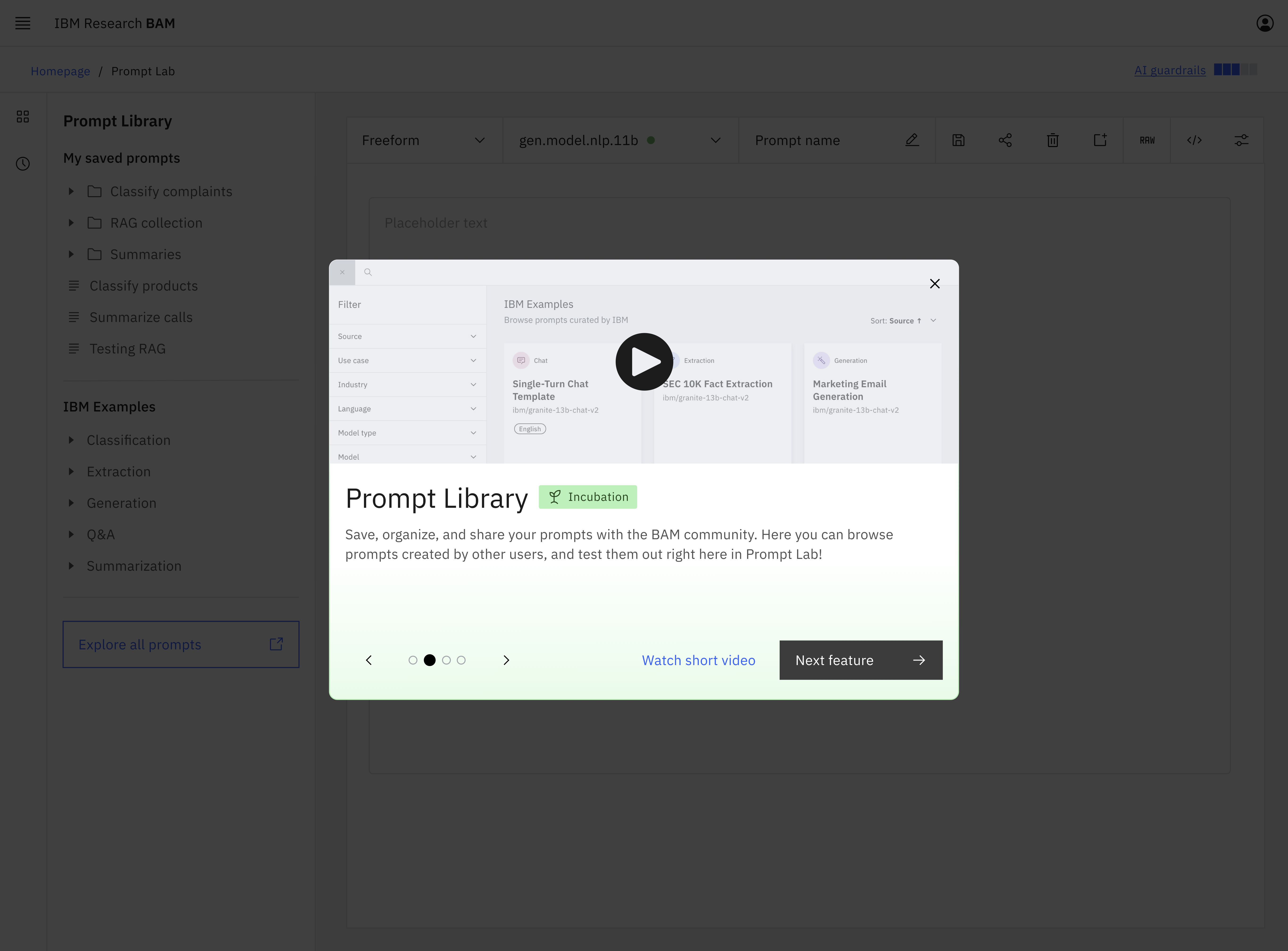
- Rewriting existing button copy to be self-explanatory. For example, the link in the navigation for the little-known community prompt library became "Community Prompt Library" instead of “Explore all prompts.
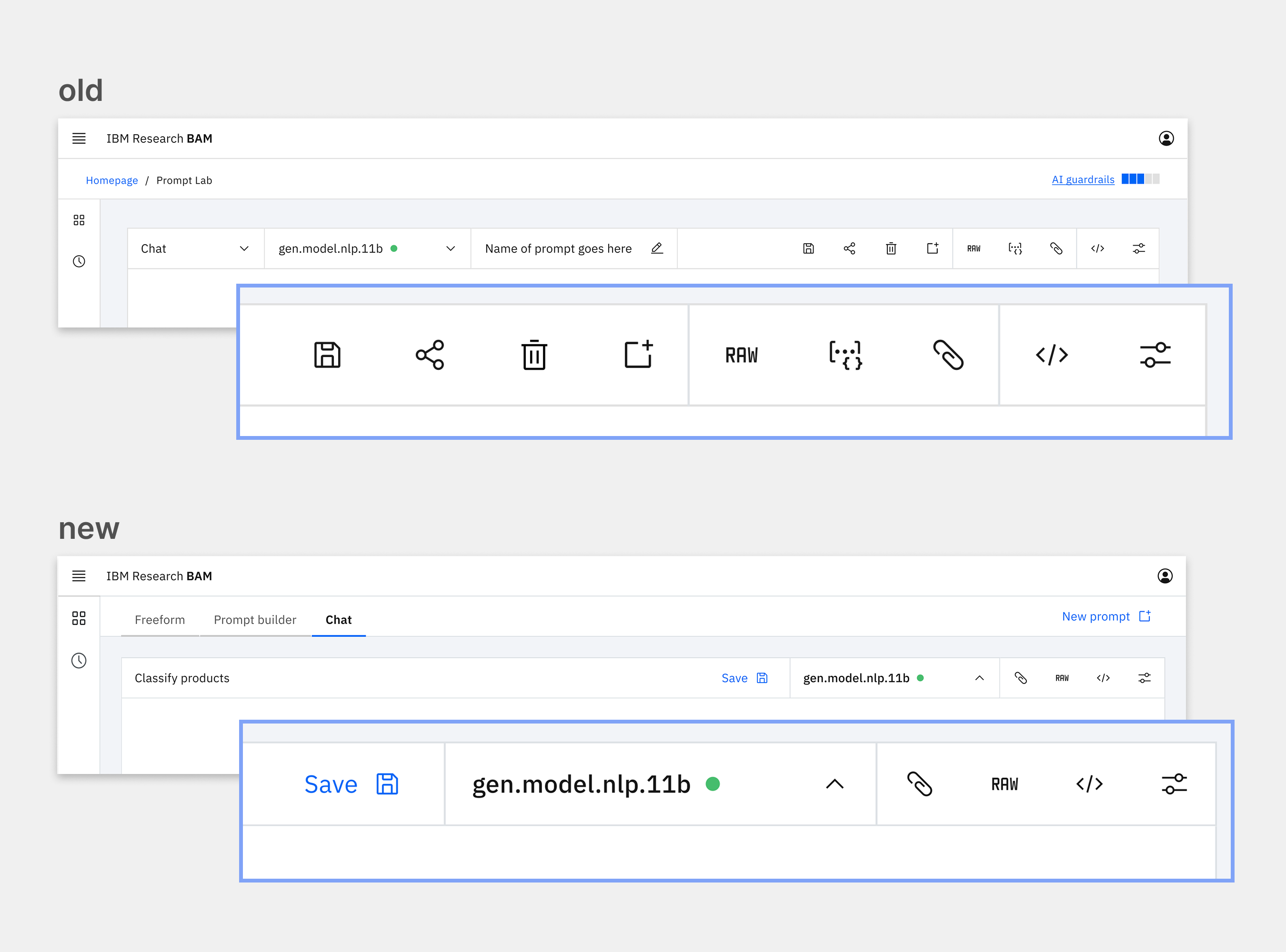
The simplified toolbar based on insights from UXR increases understandability and awareness of existing features.
UX Research drives adoption and impact beyond the product
BAM became a wildly successful, well-adopted, and highly usable internal product at scale. Within 20 months of its launch, we had over 35,000 users and had received half a billion API calls. User research from this study as well as the seven other studies I spearheaded about BAM led to my team making many evidence-based changes to BAM's interface and UX. These changes contributed to a 62% increase in active monthly users and a 31% increase in the number of monthly API calls over the five months that I led UXR as the sole UX researcher dedicated to BAM.
These insights extended beyond BAM to impact the development of watsonx.ai, IBM's flagship end-to-end AI development studio. Watsonx.ai is a customer-facing product modeled on BAM's design. My team developed and tested many new features like the prompt lab in BAM that would eventually be adopted by watsonx.ai. Watsonx.ai went on to win a Red Dot Design Award and is currently available to over 100 million users as part of the IBM Watson Suite.
Finally, the design components we created and tested in BAM are now available to 300,000 IBM users and the entire world through Carbon, IBM's open source design system. When BAM launched, there were no established patterns for gen AI in Carbon. My team contributed our evidence-based components to the Carbon for AI design system so that product teams everywhere can utilize gen AI design components. Carbon for AI was awarded an iF Design Award in 2025.